Visual Identity
Overview
Following these guidelines help project a consistent representation of the college. It is critical that the college name, logo and images be used only by approved entities and that no alternative logos or images are substituted. Santa Fe College reserves the right to remove from circulation any printed or promotional materials produced in a manner that is not consistent with these guidelines.
On This Page
Logos
Primary Logos
There are three primary logos that represent Santa Fe College. Each contains the monogram and the SF wordmark. The preferred version is the "stacked logo" which features the wordmark as "Santa Fe" stacked above "College." It is separated from the monogram by eight dots.
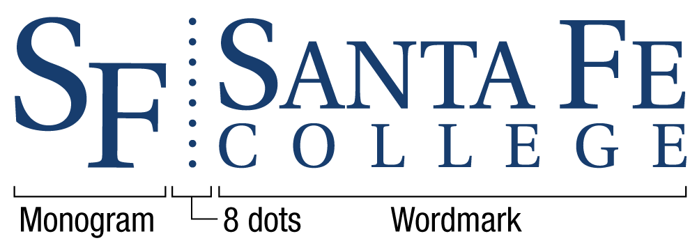
The vertical and horizontal logos can be used when it better suits the design space. The vertical logo has a much larger monogram above the stacked wordmark:

Note: Use of the college monogram and wordmark as standalone elements requires prior approval from MarCom.
For instructions on downloading the official college logo, see the Logos and Letterhead page of the Toolkit section of this Brand Guide.
Secondary Logos
Secondary logos are exactly like the primary logos, with the name of each division, department or program listed under a solid blue line.

Find your area's logos by going to the Logos and Letterhead page of the Toolkit section of this Brand Guide.
Co-Branded Logos
Any logo that demonstrates a relationship with the college is a co-branded logo. These logos are used for recruitment, retention and/or to advance the college. Creation of co-branded logos is time-intensive and MarCom is responsible for determining which entities should have one.
Internal – Internal Co-Branded logos are developed with assistance from Marketing & Communications to help distinguish programs that play a critical role in recruiting and retaining students. Eligibility for new Internal Co-Branded logos is subject to MarCom and VP approval and rules for their usage may vary.
External – External Co-Branded logos demonstrate a relationship between the college and an outside entity. These logos are developed with assistance from Marketing & Communications. Eligibility for new External Co-Branded logos is subject to MarCom approval and rules for their usage may vary.
Campaigns (i.e.- No. 1 in the Nation, Opening Doors, 50 to First)
Retired Logos
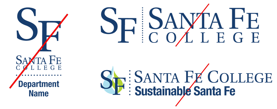
Over time, our brand has evolved, leaving a collection of retired logos that help to tell the history of the college. This collection includes logo styles that have more than eight dots, logos that overlay images over our monogram, and logos that stack a department name under the wordmark. These logos should no long be used to represent SF.
Athletics
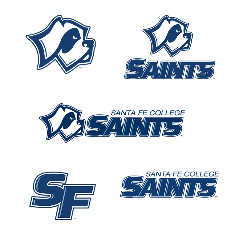
The Saints logo, monogram and Caesar's head are reserved for use only by Athletics.
Presidential Seal
Permission to use the presidential seal must be obtained from the Office of the President
Colors
Color is a crucial component for our visual communications. The combination of Saints Blue and white stands front and center in the public's perception of SF. A secondary set of colors can be used as accents: Campus blue, gold, charcoal and silver.
Follow the color values listed below when using the Pantone Matching System, CMYK, RGB, or Hexadecimal values.
-
Saints Blue
-
Campus Blue
-
Gold
-
Charcoal
-
Silver
Fonts
Our primary typeface for print and online applications is Helvetica Neue. There are many variations in the Helvetica family; the most common are shown below. Contact the Help Desk if you need help downloading fonts.
Marketing & Communications has also obtained limited licenses for several faces of our secondary typefaces Museo and The Braggest. These should be used sparingly. Museo is often used as a headline, while The Braggest adds emphasis and personality for advertisements and marketing pieces. If the secondary fonts are used too often, they lose their impact.
Helvetica

Museo

Turbinado
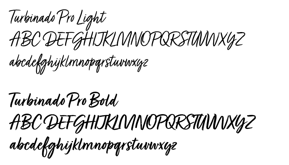
Download our fonts from the Fonts page of our Toolkit section in this Brand Guide.